Our logo, colors, and type — and a few simple rules for using them. Please keep the marks intact and the spirit dignified.
Every mark in our identity carries a story — chosen not for decoration, but for what it remembers.

The kite is a beloved Afghan pastime — but it is also a quiet philosophy. A kite climbs only when the wind rises against it; its resistance to the wind is the very thing that gives it flight. So it is with a people: what pushes hardest against us is what lifts us highest. The kite at the heart of our mark flies for that truth — for a heritage that has risen, again and again, on the strength of the winds it has faced.
Look closely and the kite's tail breaks into waves — a homage to the Pacific that meets the shore of our home in San Diego. They mark our roots in this city: a community carried across an ocean, putting down new ground without forgetting the far shore it came from.
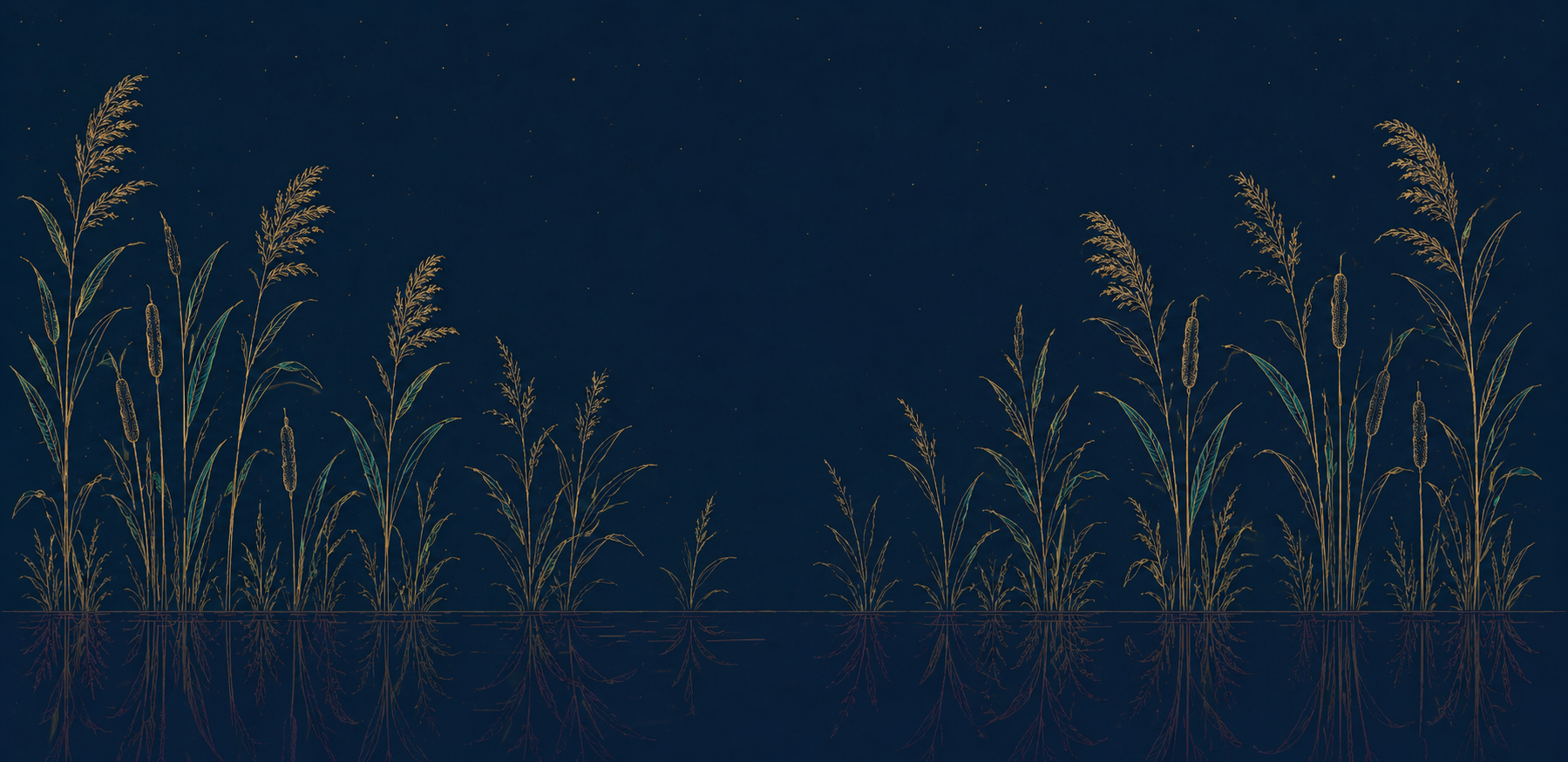
Threaded through our brand is the reed — a homage to the opening of Rumi's Masnavi. Born in Balkh, in the north of what is now Afghanistan, Rumi begins his masterwork not with an argument but with a sound, and a single instruction: listen. The reed flute sings because it was cut from the reed bed; its music is the ache of distance from home. For a people scattered far from where they began — cut, like the reed, from the soil that shaped them — no image belongs to us more completely. Champagne above the waterline, plum in the reflection beneath: the longing you only see when you look closer.
Our type pairs a voice with a ceremony — in Latin and in Farsi. Cormorant speaks; Cinzel announces. Noto Nastaliq carries the Farsi voice; Aref Ruqaa carries its poetry. Reserve the ceremonial hands for a single line — never a paragraph.
Need something not here — a vector wordmark, a specific format, or a question about usage? Get in touch →